
How to Read Bitcoin Charts: Core Elements and Practical Use (2025 Guide)
Simple rules, clear visuals: learn the basics of candlesticks, moving averages, volume, and how I actually use them.
Why Look at Charts?
Charts are not just pictures. They’re a map of market psychology. Even for long-term investors, understanding the basic structure—trend, momentum, and participation—helps you make calmer decisions and align buys/sells with context rather than headlines.
Chart Basics: The Core Elements
1) Candlesticks
- Body: shows open vs. close. Green = up (close > open), red = down (open > close).
- Wicks (shadows): show intraday high/low. Long upper wick → selling pressure; long lower wick → buying defense.
Quick read: candlesticks reveal who had control that session—buyers or sellers.
2) Moving Averages (MA)
- Short-term (e.g., MA7): fast, great for short swings and timing nibbles.
- Medium-term (e.g., MA25): filters noise; helps confirm if a bounce has legs.
- Long-term (e.g., MA99/200): big-picture trend and potential regime shifts.
Signals: golden cross (short MA crosses above long) vs. death cross (short MA falls below long).
3) Volume
- Green bars = buying participation; red bars = selling participation.
- Rising price with rising volume = stronger trend confirmation.
- Rising price without volume = weak/temporary moves are more likely.
4) Support & Resistance
- Support: zones where price repeatedly stabilizes/bounces—buyer interest.
- Resistance: zones where rallies often stall—seller interest.
5) Trend & Patterns
- Uptrend: higher highs and higher lows.
- Downtrend: lower highs and lower lows.
- Range: box-like consolidation where support/resistance are well-defined.
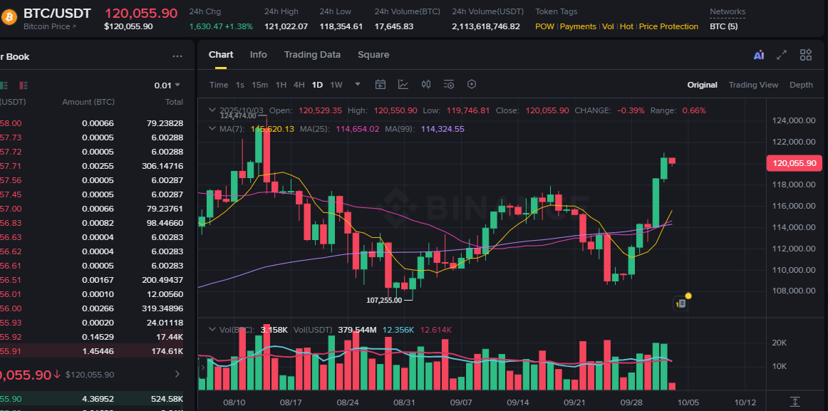
Reading the Chart You See Above
- Candles: green = close above open (up day), red = close below open (down day).
- MA7 (short, yellow): quick trend; watch for crossovers above MA25/MA99.
- MA25 (medium, purple): validates whether a bounce is more than a blip.
- MA99 (long, blue): higher-timeframe structure; candles reclaiming above this line often signal improving regime.
- Volume: note how strong green bars during an up-move imply real buying pressure, not just drift.
In practice: when short MA curls up above medium/long while volume expands, I treat pullbacks more constructively. If price loses the long MA on rising red volume, I get more defensive.
How I Actually Use This
- For entries (DCA buys): prefer pullbacks where price holds above a medium/long MA and volume doesn’t scream distribution.
- For exits (partial sells): avoid chasing overbought spikes (e.g., RSI overheated); trim into strength when volume fades.
- Keep it simple: a few rules, written down, beat dozens of conflicting indicators.
Final Notes
Charts don’t predict the future; they clarify the present. With just candles, MAs, and volume, you can read whether a move is healthy or stretched—and fit that context into a long-term plan like DCA buys and partial selling.